How did we get here?
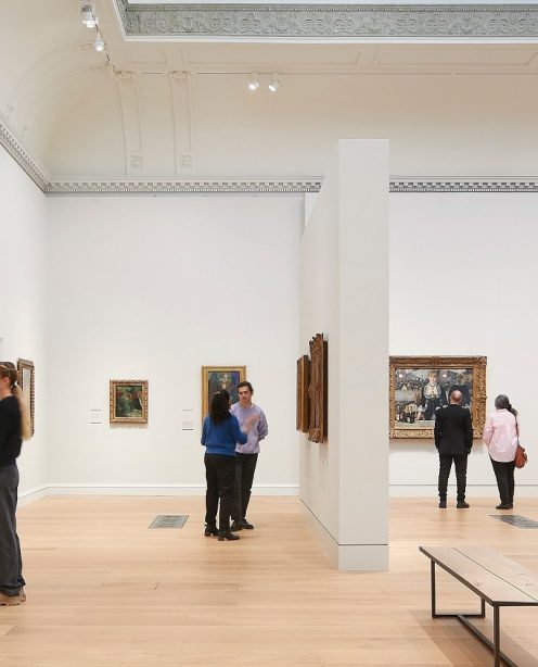
Our workshops focus on the user first and we try to identify, and agree with the client what the 'Red Routes' of their site need to be. Red Routes are the main user journeys and goals. We can then hang other decisions off this, knowing that the users' tasks are foremost. In this case, it was a little tricky to identify what the sites main role was as the museum has so many diverse audiences looking for such types of content. The Red Routes for this project were:
- Visit / Info / logistics – make it easier for visitors to find out about practical information and enhance their expectations about visiting an historic house museum
- Tickets – increase sales and bookings for free events
- Collections & Research – encourage users to explore the work done at the museum
We started with some research (through analytics, reviewing visitor research and discussions with staff) and workshops (UX, content, user journeys) to define what that meant in terms of requirements for the website. The research also informed the personas we developed and various iterations and development of the site structure, content and design were to enhance these. Once the site was up and running we also set up some Goals in Google Analytics to help us track movement across several different digital channels - for example the online shop and the collections system.
A few weeks post-launch and a review of stats did indeed show that the new site was working well overall but there was one negative item which stood out like a sore thumb.
For many of the income related items, the actual transaction takes place off the main site in a different digital channel. As a result, a key element in the design of this site was to clearly direct users to the right channel (and where possible - the right page!). The UX workshops we did with the client highlighted the importance of the content in two particular channels - the online collections and the shop. Between them they contain a wealth of information that is valuable or useful in some way to a wide range of users. Together, we chose to include permanent links to these two channels throughout the site, in the header. Their position on the page (top right) was chosen so that they'd be consistent with the old site and users would know where to find them.
One element of our process in interaction design was to include having a 'shrinking, sticky' header so that the site's primary navigation would always be on-screen and secondary header elements would fall off screen. This would be especially important on the event pages so that any relevant 'Book' link would also stick and be on page, helping increase sales.
So both we and the client felt quietly confident that we'd created a solid solution for the site, that users would always have a way of finding the quickest route to their destination and get things done efficiently. The post launch stats however, revealed a substantial drop off of clickthroughs from the main site to the online shop linked to in the top right corner of the page. And unfortunately, this drop in clickthroughs was starting to affect sales.
What next?
So, although the call to action is basically in the same, familiar location as on the previous site and was indicated with a nice, clear button. 50% fewer users were finding it or clicking on it. Why?
We needed to work out what might be the problem as soon as we could. We came up with a few theories:
Sticky Header
The old site didn't have this feature, so if you wanted to review the site navigation, you'd have to return to the top of the page. The sticky nav on the new site shrinks on scroll to save space (especially important on smaller devices) but this meant that only the main navigation was displaying. It's fascinating that having those links in a non-sticky header would have been easier for the user to find than having them fall off the stick header. It seems the user is expecting similar items in the header regardless of its state (full or scrolled and shrunk). If we add the button into the smaller version of the header, so that it's visible at all times, that could help users find the link.
Position
Top right is a common location for the search function on websites. The 'shop' button sat to the right of a button which invites the user to 'search the collection'. Perhaps, when scanning the page, users were seeing the word 'search' in that corner and not reading beyond that point. This would mean that they weren't catching site of the link. If we swapped the buttons over so that the first word the user reads is 'shop' then they're more likely to spot it when scanning the page.
Styling
Whilst the two external links in the header - to shop and collections - are both vital parts of the work the museum does, the shop has a wider appeal and is an income generator. We figured that if we could make it stand out from the crowd a bit more then that would help get some attention.
As we'd noticed this at the beginning of the peak Christmas shopping period, we didn't have any time to spare! The most effective way to test these out was to just do the work. So, we've popped the links into the shrunken version of the header so that they're omnipresent. We've swapped the order of the buttons so that you read it first and reversed the colours on the button so that it stands out a little bit more. Now we're carefully monitoring Google Analytics to see what happens.
The Result?
Well, it's early days but so far so good... Clickthrough from the website to the shop is up 46% on the previous week (same 4 days a week earlier). We'll keep an eye on things and solicit feedback from users over the next few weeks to make sure we've got it right this time.
At the very least, this shows the value of both setting up and regularly reviewing your website analytics and taking an iterative approach to the design of your website. There's always room for improvement!